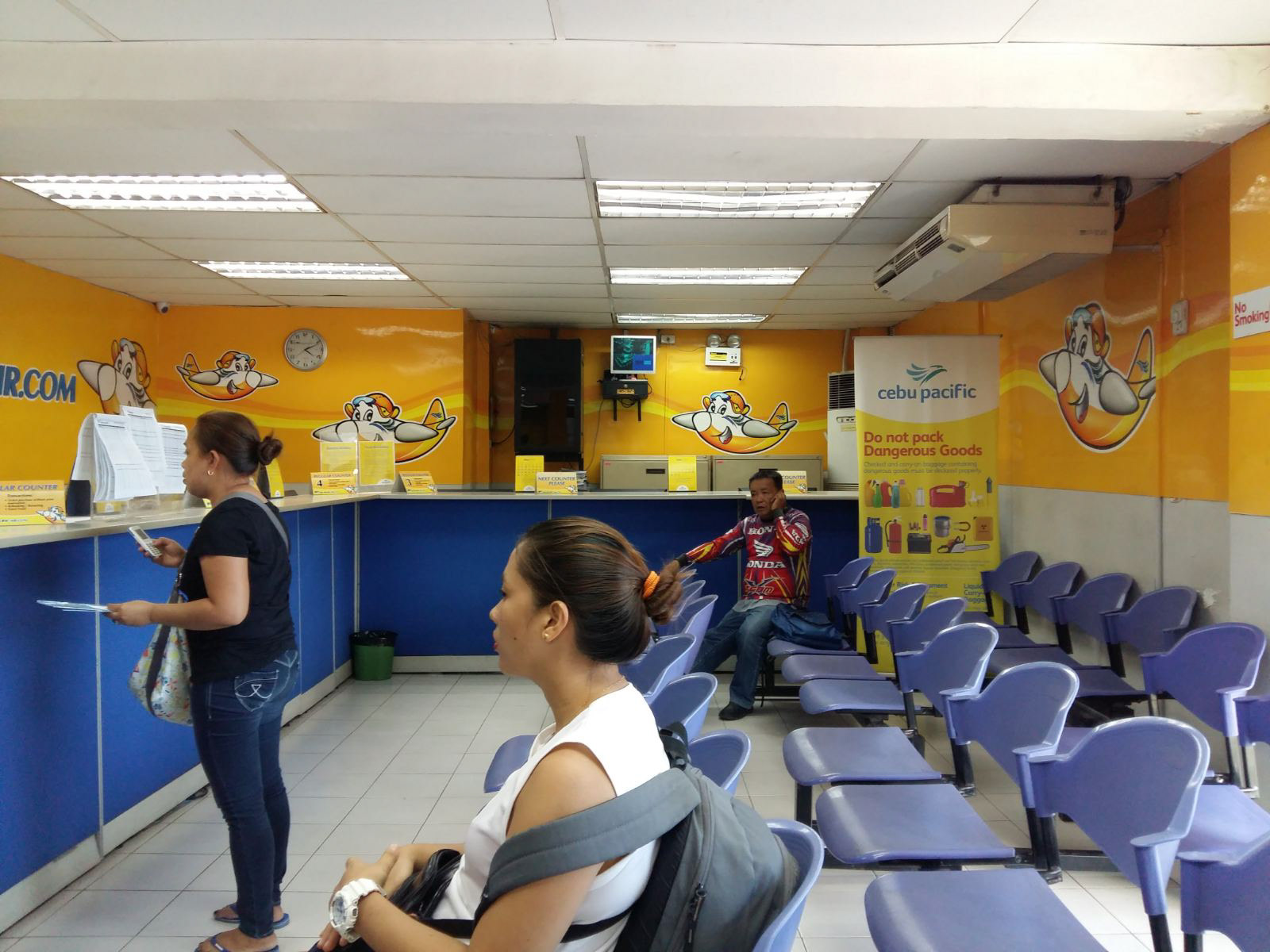
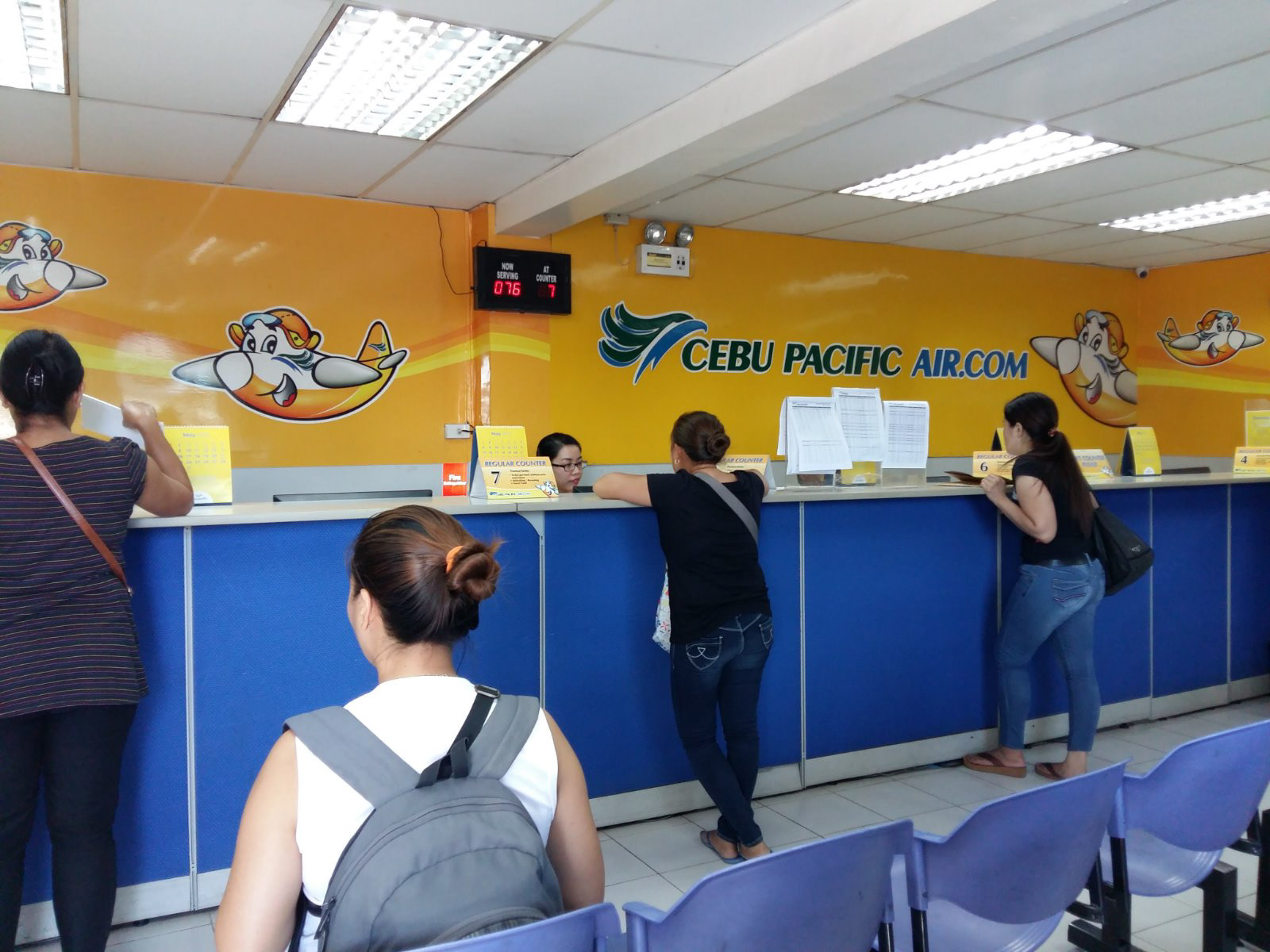
The brief was to redesign how the ticketing office is experienced by a traveller. We designed the interaction to be open and engaged, conveying an atmosphere of care and mutual trust. We did away with ganged up chairs typical of an airline ticketing office and instead offered sharable benches in friendly shapes without corners. Luggage placement was also thought of, with enough floor space to accommodate transient and hurried passengers.
It was also important to convey clarity and efficiency in service. To do this, we lowered the agent tables and introduced a slightly curved table top design suggestive of aircraft wings for a friendlier, more approachable feel. The Express counter was set up closest to the door, separate from regular transactions to give the clients that shared sense of urgency.
All graphic work was done by Studio Dialogo.
This was how it looked like before the update:

